
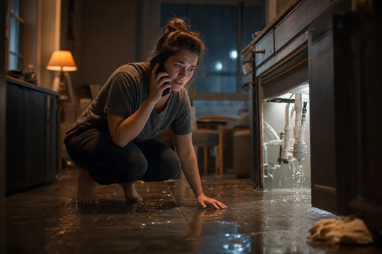
When a homeowner's basement is flooding at 11 PM, they're not browsing. They're not comparing. They're tapping the first search result that loads, looking for a phone number, and calling. If your site makes them work for that number, wait for the page to render, or fill out a form before they can reach a human, they're gone. The next result is one tap away.
Emergency searches are the highest-intent, highest-value traffic a home service website can receive. A burst pipe, a dead furnace in January, a sparking electrical panel, these aren't research sessions. They're decisions happening in seconds. And the website that captures that decision wins a job worth $300 to $3,000 or more. Every dollar you invest in organic rankings and paid ads to earn that traffic is wasted if the page itself can't close the call.
Research from Google's mobile page speed analysis found that as page load time increases from one second to three seconds, the probability of a visitor bouncing increases by 32%.
From one second to five seconds, that probability jumps 90%. And 53% of mobile site visits are abandoned entirely if the page takes longer than three seconds to load. For a homeowner standing in water, those three seconds are an eternity.
These five website changes aren't redesigns. They're targeted fixes to the specific points where emergency visitors drop off before they ever call. Each one is implementable without rebuilding your site, and each one directly connects to more booked jobs from the traffic you're already getting.
IN THIS ARTICLE
- 1Click-to-call needs to work before the page even finishes loading
- 2Load time decides whether an emergency search waits around
- 3A shorter form beats a longer one when someone is standing in water
- 4Trust signals next to the call button remove hesitation fast
- 5After-hours visitors need somewhere to go besides a closed sign
Keep reading to see the five changes that turn a panicked search into a booked call.
Click-to-call needs to work before the page even finishes loading

The phone number is the conversion event on an emergency service page. Not a form. Not a chat widget. Not a "request a callback" button. The phone number. If a visitor has to scroll, pinch, zoom, or navigate to find it, you've already lost a percentage of the callers who would have booked.
For emergency traffic specifically, the path from search result to phone call needs to be frictionless. One tap on the search listing, one glance at the page, one tap on the phone number. Three actions, total. Anything beyond that is a leak in the funnel.
A phone number buried below the fold costs the call before it starts
"Below the fold" means the visitor has to scroll to see it. On mobile, the fold is roughly the top 600 pixels of the screen. If your phone number lives in the header on desktop but collapses into a hamburger menu on mobile, it's invisible to the emergency visitor who just landed on your site.
The fix is a phone number that's visible and tappable within the first screenful of content on mobile. Not in a navigation menu. Not in a footer. Not behind a "Contact Us" button that loads a new page. On the page, above the fold, in a font size large enough to tap without zooming.
The placement matters more than the design. A plain phone number in large text at the top of a mobile page outperforms a beautifully designed header that hides the number behind an icon. Emergency visitors aren't admiring your layout. They're scanning for the fastest way to reach a human.
Test this right now. Pull up your site on your phone. Don't scroll. Can you see the phone number? Can you tap it and initiate a call without any additional steps? If the answer is no, that's the first fix.
Tap-to-call has to work without a second screen tap or zoom
A phone number displayed as text on a mobile page should be wrapped in a clickable tel: link so that tapping it initiates a call directly. This sounds basic. It's missing on a shocking number of home service websites.
Common failures:
- The phone number is displayed as an image, not as text with a tel: link, so tapping it does nothing
- The number is formatted with parentheses and dashes in a way that some mobile browsers don't auto-detect as callable
- The tap target is too small, requiring precise finger placement or zooming on smaller screens
- The number links to a "Contact Us" page instead of initiating a call
Each of these failures adds a step between the visitor and the call. One extra step might cost you 10% to 20% of your emergency conversions. That's real money when each missed call represents $285 to $1,200 in potential revenue for a home service business.
A sticky call button keeps the option visible through the whole scroll
Even with a phone number above the fold, some visitors will scroll down to read more before deciding to call. A sticky call button, a floating bar or button fixed to the bottom of the mobile screen that stays visible as the visitor scrolls, ensures the phone number is always one tap away regardless of where they are on the page.
The sticky call button should:
- 1Stay fixed to the bottom of the mobile viewport at all times
- 2Display the phone number or a clear "Call Now" label
- 3Initiate a call with a single tap (tel: link, no intermediate page)
- 4Be large enough to tap easily but not so large it obscures the content
This is one of the highest-impact, lowest-effort changes a home service website can make. The implementation is a few lines of CSS and HTML. The impact on emergency conversion rates is measurable within weeks.
Some contractors worry that a sticky call button looks "aggressive" or "salesy." For emergency service pages, that concern is backwards. The visitor is looking for the fastest way to call. Putting the phone number in their face is exactly what they want.
Load time decides whether an emergency search waits around

A homeowner with a flooded basement, a broken AC in 100-degree heat, or a gas smell in the kitchen is not patient. They're on their phone, probably on cellular data, possibly in a basement with weak signal. Your page has about three seconds to load before they tap back and call the next company on the list.
Speed on emergency pages isn't a technical nicety. It's a revenue decision.
Conversion rate drops sharply between a one-second load and a five-second one
The data on speed and conversion is consistent across every study. Websites that load in one second see conversion rates 2.5 times higher than those loading in five seconds. A one-second delay in load time can reduce conversions by up to 20% on mobile. And the relationship is nonlinear: the damage done between one second and three seconds is far greater than the damage between three seconds and five seconds.
For a home service company running Google Ads on emergency keywords, every click costs money. If your landing page takes five seconds to load and loses half the visitors before it renders, you're paying full price for clicks that never had a chance to convert. Fixing load time from five seconds to two seconds can double your conversion rate without changing a single word on the page or spending an additional dollar on ads.
Mobile speed matters more here than desktop ever will
Emergency searches happen on phones. The homeowner isn't sitting at a desktop computer while water pours through the ceiling. They're standing in the mess, on their phone, often on a cellular connection that's slower than their home Wi-Fi.
The average mobile page still takes significantly longer to load than its desktop equivalent. Google's own research found that the average mobile landing page takes roughly 15 seconds to fully load, far beyond the three-second threshold where most visitors leave.
The practical checklist for mobile speed on emergency pages:
- Run Google PageSpeed Insights on your top service pages and check the mobile score specifically
- Target a Largest Contentful Paint under 2.5 seconds on mobile
- Compress all images to web-optimized formats (WebP where supported, compressed JPEG otherwise)
- Defer non-critical JavaScript until after the page renders
- Remove any scripts that aren't directly contributing to the conversion (social media widgets, unnecessary analytics tools, third-party chat scripts that load heavy libraries)
A page that scores 90 or above on PageSpeed Insights mobile is fast enough for emergency traffic. A page scoring below 50 is actively losing you calls.
Heavy images and popups slow the exact page a panicked visitor lands on
The most common speed killers on home service emergency pages:
- Hero images uploaded at full resolution (a 4MB photo of a technician that could be 200KB as a compressed WebP)
- Popup modals that load JavaScript libraries and block the initial render (newsletter signups, promotion banners, cookie consent overlays that fire before the content loads)
- Chat widgets that pull in external scripts on every page load regardless of whether the visitor uses them
- Embedded Google Maps loading the full Maps JavaScript API when a static map image or a simple address link would suffice
- Multiple tracking scripts from different vendors firing simultaneously
Each of these adds hundreds of milliseconds to your load time. Stacked together, they can push a page from two seconds to five seconds, crossing the threshold where more than half your emergency visitors leave.
The fix is prioritization. On emergency service pages, strip everything that isn't directly contributing to the visitor's ability to call, read about your service, and trust you. Every element that delays the phone number appearing on screen is a conversion cost.
A shorter form beats a longer one when someone is standing in water

Not every emergency visitor will call. Some prefer to type, especially younger homeowners who default to text-based communication. A contact form captures those visitors, but only if the form respects the urgency of the situation. A ten-field form asking for address, project description, preferred schedule, and "how did you hear about us" is a wall that an emergency visitor will not climb.
Asking for a full project description upfront pushes the visitor elsewhere
An emergency visitor knows two things: they have a problem, and they need someone to fix it now. They don't want to describe the problem in detail in a text field. They don't want to select from a dropdown of 15 service categories. They don't want to upload photos of the damage while their basement fills with water.
The form fields that matter for an emergency submission:
- Name
- Phone number
- Type of emergency (dropdown with five or fewer options: plumbing, electrical, HVAC, roofing, other)
That's it. Three fields. Everything else can be gathered on the phone when you call them back. Every additional field you add reduces completion rates. Research on form conversion consistently shows that reducing form fields from seven to three can increase completion rates by 25% to 50%.
The goal of the emergency form isn't to gather a complete project brief. It's to capture the lead's phone number so you can call them within minutes.
Breaking the form into small steps outperforms one long block of fields
If your form genuinely needs more than three fields (for example, you need the address to determine service area eligibility), break it into a multi-step form rather than displaying all fields at once.
Step one: "What's the emergency?" with three or four large, tappable buttons (water leak, no heat, electrical issue, other). Step two: "What's your name and phone number?" Step three: "What's the service address?"
Each step shows only one or two fields. The visitor sees progress ("Step 1 of 3") and doesn't feel overwhelmed. Multi-step forms consistently outperform single-page forms because they reduce the perceived effort at each stage.
The first step should require zero typing. Tappable buttons for emergency type eliminate the friction of the keyboard and make the form feel fast. By the time the visitor reaches the phone number field, they've already invested effort and are more likely to complete the submission.
Separating emergency requests from routine quote requests speeds up the response
If your website has one contact form for everything, emergency submissions get mixed in with routine quote requests, general inquiries, and spam. The emergency visitor's form submission sits in the same inbox as "I'm thinking about a new water heater sometime next year," and your team might not see it for hours.
A dedicated emergency form, clearly labeled "Emergency Service Request" and positioned separately from the general contact form, does two things:
- 1It tells the visitor this is the fast track, reinforcing that you take urgency seriously
- 2It triggers a separate notification workflow that alerts your on-call team immediately
The ideal setup routes emergency form submissions to a dedicated email or text alert that goes directly to the dispatcher or on-call technician, not to a general inbox that gets checked once a day.
Trust signals next to the call button remove hesitation fast
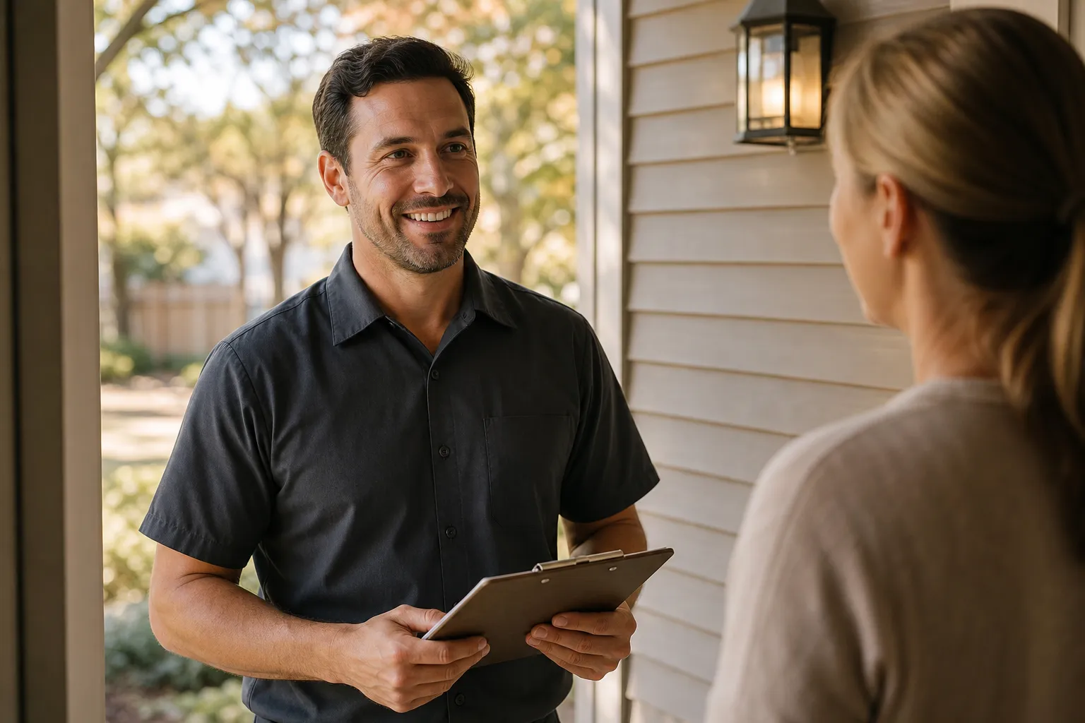
An emergency visitor is about to let a stranger into their home, often at night, during a crisis. The decision to call isn't just about finding the number. It's about trusting the company enough to open the door. Trust signals placed next to the call-to-action reduce the hesitation that sits between "I found this company" and "I'm calling them now."
A licensed and insured badge reassures someone letting a stranger into their home
The words "licensed and insured" next to your phone number or call button cost nothing to add and directly address the number one fear an emergency homeowner has: is this company legitimate?
Display your state contractor license number visibly on every service page. If your trade requires specific certifications (EPA 608 for HVAC, state plumbing license, electrical contractor license), list them. Add your insurance status. These aren't marketing claims. They're verifiable credentials that separate you from the unlicensed operator running ads in the same market.
The U.S. Consumer Product Safety Commission has documented that over 40,000 residential fires each year are caused by electrical wiring problems, making licensed electrical work a safety-critical service. When a homeowner is searching for an emergency electrician at midnight, seeing "Licensed Electrical Contractor, License #12345" next to the call button isn't a nice-to-have. It's the reason they call you instead of the listing below you.
Recent reviews reassure faster than a testimonials page buried in the footer
A Google review rating displayed next to the call button ("4.8 stars, 312 reviews") does more for emergency conversion than a dedicated testimonials page that the visitor will never find.
The placement matters:
- Display the review count and rating near the phone number, not on a separate page
- Show the date of the most recent review if possible ("Last review: 2 days ago")
- Pull one or two short review quotes that mention emergency service specifically ("They came out at midnight and fixed the leak in an hour")
Emergency visitors don't have time to browse a testimonials page. But a visible star rating next to the call button answers the trust question instantly: other people have called this company, recently, and they were satisfied.
The businesses that display their Google Business Profile reviews prominently on their website see measurably higher conversion rates than those that don't, and the effect is strongest on emergency pages where the decision happens in seconds. The contractors with the strongest client results almost always have their review data front and center on service pages, not buried on a separate testimonials page.
A same-day availability message answers the question before it gets asked
The question in an emergency visitor's mind isn't "do they offer this service?" It's "can they come today?" A message like "Same-Day Emergency Service Available" or "24/7 Emergency Response" placed prominently on the page answers that question before the visitor has to call and ask.
This isn't about making promises you can't keep. If you offer same-day emergency service, say so visibly. If you offer 24/7 service, put it in the hero section of every service page. If you can typically respond within a specific window, state it.
The absence of availability information creates doubt. The visitor wonders: "Do they even do emergency calls? Are they closed right now? Will they come today or make me wait until Monday?" Each unanswered question is friction that pushes them toward the competitor who answered it upfront.
After-hours visitors need somewhere to go besides a closed sign

According to research analyzing over 60 million phone calls to home service businesses, roughly 27% of all inbound calls go unanswered. Of those callers who reach voicemail, fewer than 3% leave a message. The rest hang up and call someone else. For emergency traffic that arrives after hours, when your office is closed and your team is off the clock, the conversion problem is even more acute.
A significant percentage of home service searches happen outside business hours. Emergencies don't schedule themselves between 8 AM and 5 PM. The businesses that capture after-hours emergency traffic, whether it comes from Local Service Ads, organic search, or direct visits, are the ones that have something, anything, responding when the phone isn't answered.
A chatbot that qualifies urgency can capture a call the phone missed
An AI chatbot or automated intake system on your emergency pages can bridge the gap between a visitor arriving and a human responding. The chatbot doesn't need to diagnose the problem. It needs to do three things:
- 1Confirm the visitor has reached the right company for their emergency
- 2Collect their name, phone number, and a brief description of the issue
- 3Set an expectation for when they'll hear back ("Our on-call technician will call you within 15 minutes")
That interaction captures the lead even when nobody is answering the phone. Without it, the visitor hits your site, sees no way to reach a human, and calls the next company.
The chatbot should be lightweight. Not a heavy JavaScript application that slows down the page. Not a full AI conversational platform. A simple, fast-loading widget that asks two or three questions and captures a phone number. Speed matters here just as much as on the rest of the page.
A missed call left unanswered for 30 minutes rarely turns into a job
The lead response research is stark. A study published in Harvard Business Review found that businesses responding to an online lead within one hour were nearly seven times more likely to qualify the lead than those that waited even one hour longer, and 60 times more likely than businesses that waited 24 hours or more. Separately, the MIT Sloan lead response management study found that contacting a lead within five minutes makes you 100 times more likely to reach them and 21 times more likely to qualify them than waiting 30 minutes.
For emergency home service calls, the window is even tighter. The homeowner with a burst pipe isn't waiting 30 minutes. They're calling the next plumber within 60 seconds.
If your business can't answer the phone 24/7, the next best option is an answering service or AI receptionist that picks up within seconds, gathers the critical information, and dispatches to your on-call team immediately. The cost of a missed emergency call, estimated at $285 to $1,200 per missed opportunity in home services, almost always exceeds the cost of the after-hours answering solution. And every lead you lose after hours is a lead your Meta Ads retargeting and paid search campaigns paid to generate.
Weekend and overnight visitors convert only if something responds immediately
The highest-converting after-hours setup for a home service website combines three elements:
- A sticky call button that routes to an answering service or AI receptionist instead of voicemail after hours
- An emergency contact form that triggers an immediate text alert to the on-call technician
- An automated text reply to form submissions that confirms receipt and sets a callback window ("We received your emergency request. Our on-call technician will call you within 15 minutes.")
Each element catches visitors at a different touchpoint. Some will call. Some will fill out the form. Some will engage with a chatbot. The businesses that cover all three pathways capture the maximum number of after-hours leads, while competitors whose websites effectively shut down at 5 PM lose every one of them.
Service Scalers builds websites specifically for home service businesses, with emergency conversion architecture built into every page. If your current site is losing emergency calls to slow load times, buried phone numbers, or after-hours dead ends, a free website audit shows you exactly where the leaks are and what to fix first. No commitment.
Conclusion
Emergency searches are the most valuable traffic a home service website receives. Every visitor who lands on your site during a crisis is ready to book. The only question is whether your site makes it easy enough for them to do so before they give up and call someone else.
These five changes, a visible click-to-call above the fold, a page that loads in under three seconds, a short emergency form that captures a phone number in seconds, trust signals placed where the decision happens, and an after-hours system that responds when you can't, are the difference between a website that converts emergency traffic and one that loses it.
None of them require a full redesign. All of them can be tested and measured within weeks. And collectively, they can double the number of emergency calls your site generates from the same traffic, which means more booked jobs without spending an additional dollar on advertising.
If you're ready to turn your website into a conversion engine for emergency calls, reach out to Service Scalers. We build and optimize websites exclusively for home service businesses, and every change we make is measured against the only metric that matters: booked jobs.